How excited are you about the 2016 Color of the Year?
Even if you have not been breathless with anticipation, there is a value to watching as the 2016 Colors of the Year develop into trends that help you freshen up the look of your home.
There is not much controversy between the two leading paint companies, Benjamin Moore and Sherwin Williams. Both select a version of white consistent with the current cultural desire for calm and simplicity.

Benjamin Moore Simply White Video Sherwin Williams Alabaster Video
From the standpoint of architectural integrity and composition, we agree with the importance of the color white in all of its variations.
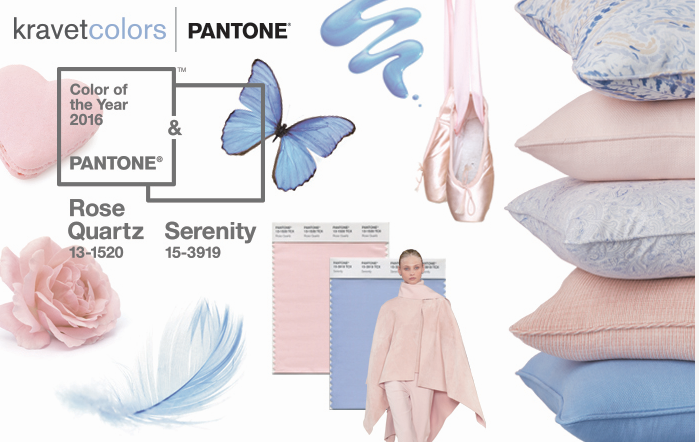
However, when Pantone pioneered two interacting Colors of the Year 2016, Rose Quartz & Serenity, a new understanding of color direction emerged.
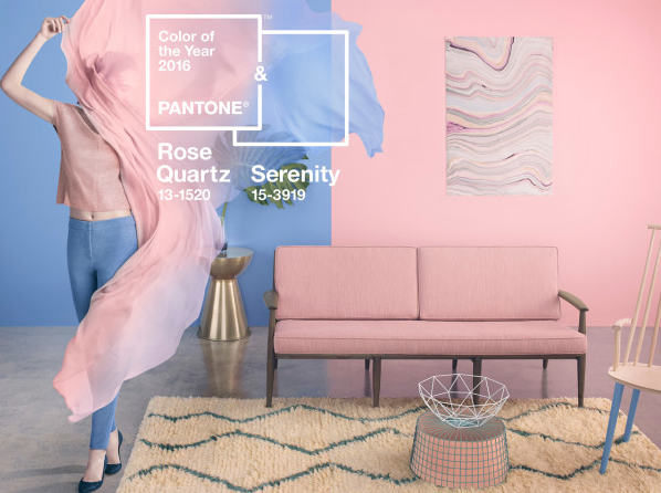
Interplay or the interaction of color becomes the theme running through the 2016 color predictions.
Interplay is a technique we often use when creating interior and exterior architectural statements. Here are some of our favorite ideas that will help you update the color impression of your home.

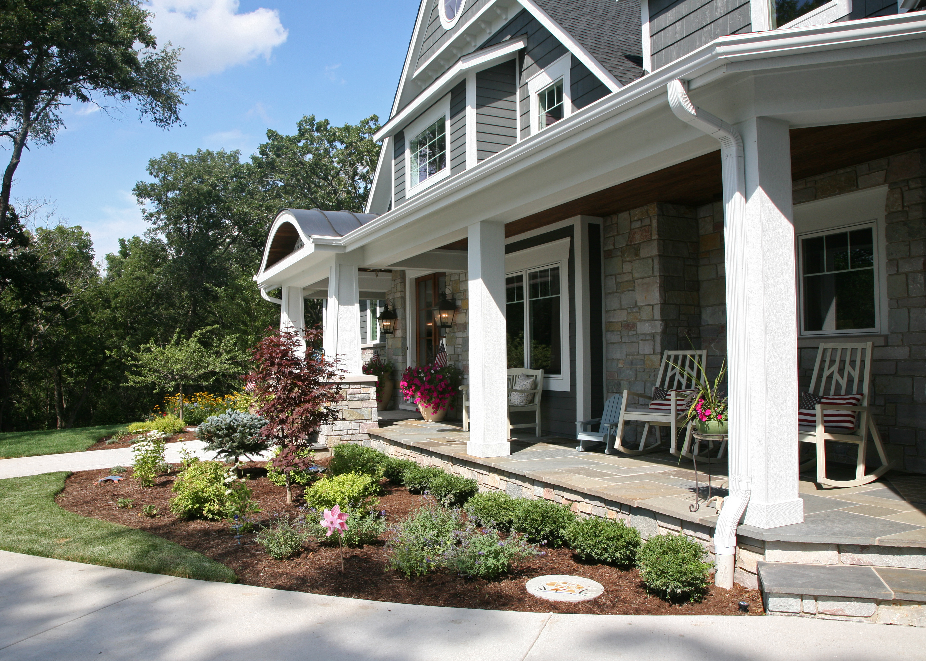


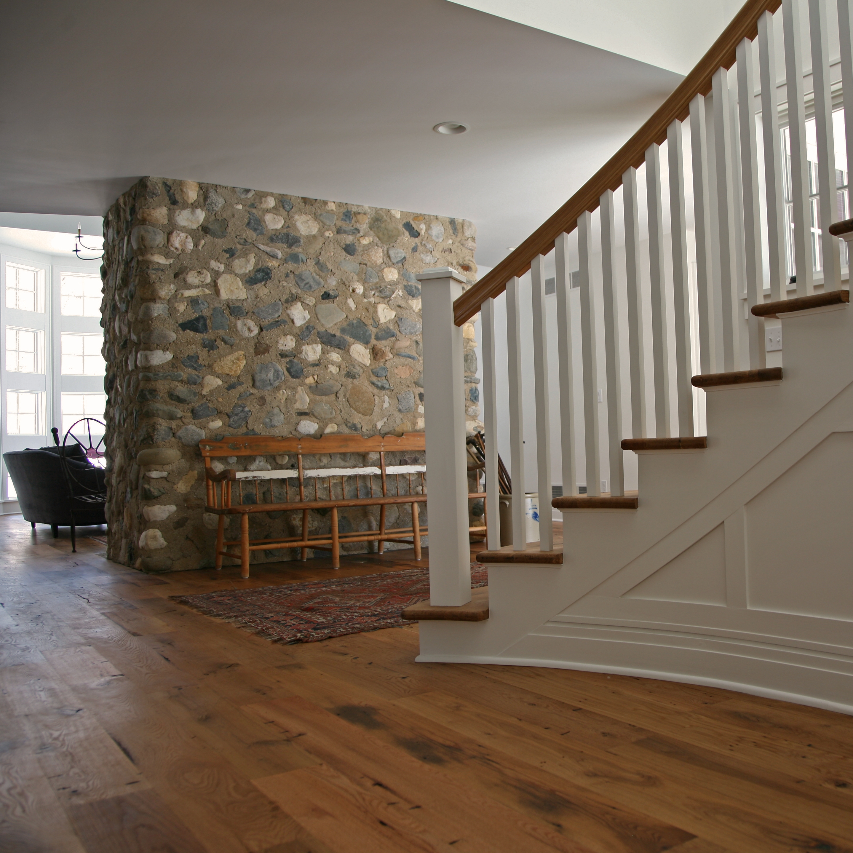
The Pantone 2016 Colors of the Year were selected with the intention of pairing calm harmonious hues. The specific color is not as significant as the fluidity of the pairing. Keep balance in mind when applying color to your home and you will be on track for 2016.
